
Table of Contents
Analytics Dashboards
Findem provides in-platform analytics under the Dashboards tab in the platform. This is your hub for all reporting and sourcing metrics in Findem. You can access these dashboards through the dashboard button on the left-hand side of the home page.
Findem offers multiple analytics dashboards, including candidate analytics and other specialized views to help you understand your talent acquisition efforts. For a comprehensive understanding of all available dashboards, we recommend scheduling a walkthrough with the Findem support team.
We've introduced four new dashboards in Findem, designed to transform how talent acquisition (TA) teams measure and optimize their sourcing operations. These dashboards include:
-
Right Start Analytics: Tracks the adoption and utilization of Findem's tools across the TA team in the first 90 days, including:
- Profiles Viewed
- Inbound Applications Reviewed
- Time to App Review (days)
- Candidates Contacted
- Sourcing Mix by Hiring Channel: applicants advanced via Inbound Management in addition to Shortlisted Candidates. *Note - Profile Views are not currently an action tracked to define 'engaged users'. The plan is to address changes to the 'engaged user' definitions in a future release
-
Sourcing Utilization: Monitors the user activity that drives success using the Findem Platform, empowering leaders to take action. Activity includes:
- Inbound Applications Reviewed
- Time to App Review (days)
- Candidates Contacted by User
- Logic has been updated in % Open ATS Jobs per User to account for "limited access" postings for customers with Jobvite
-
Sourcing Performance: Quantifies the return on investment (ROI) of Findem's Platform, demonstrating its value to the organization. Attribution calculations are refined to be more strict, only displaying timestamps for Findem activity that occurs before a relevant period prior to ATS Application date, regardless of whether it was used to establish attribution.
- Candidate Name has been added to the underlying data tables
- Outreach Analytics: Highlights areas of improvement and success, enabling teams to dive deeper into their data.
Troubleshooting Dashboard Access
If you are unable to see the Findem Analytics Dashboard, contact Findem Support. They can review your user account permissions and help restore access if needed. The Support team will work with your Customer Success Manager (CSM) to verify and reinstate your analytics permissions.
Learn more about how these platforms work!
Filters and Reports
Each dashboard is structured in two sections: Filters and Reports.
Filters allow users to select the data that appears in the reports below. They apply to all reports in the dashboard unless otherwise noted in a report's description.
Reports are a series of interactive visualizations representing actions taken in the Findem platform and the associated outcomes.
Applying Filters
As you adjust the filters at the top of the screen, the data and associated reports below will update accordingly.
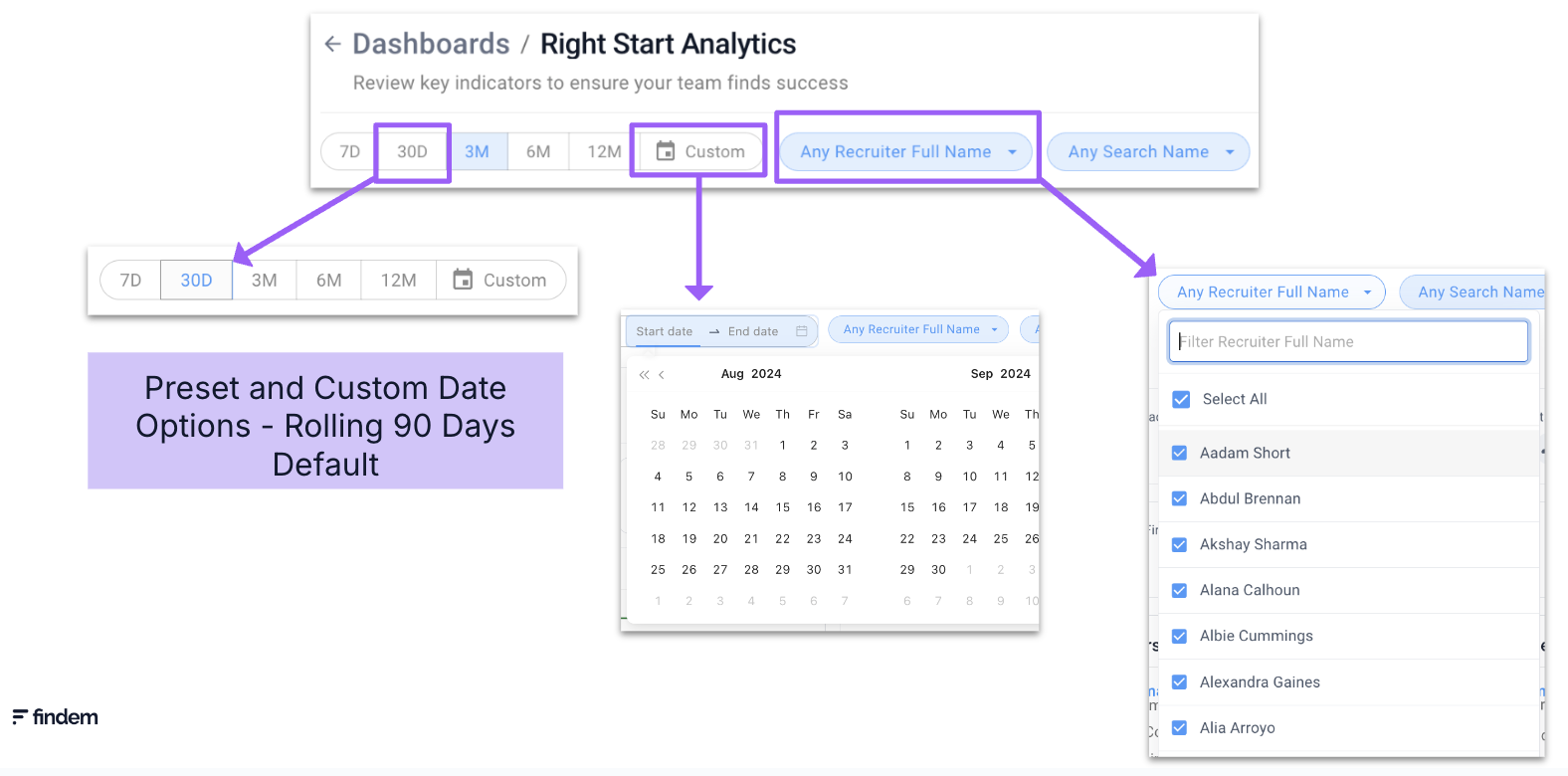
The time period filter affects all reports in the dashboard and is set by default to show the last 90 days of user activity. If you want to analyze the data by a different time frame, you can use the preset options or select a custom date.
For example, to focus on the last 30 days of user activity, click 30D to update the all reports to that time frame.
Dashboards and reports can also be filtered by other relevant data dimensions. All dashboards in Analytics Essentials include a filter for User/Recruiter Name and Product/Search Name. You can also include filters for team hierarchy levels, roles within your organization, and region by supplying the relevant data to your CSM.
To enable regional or organizational-level reporting (for example, to break out users and engagement by region), Findem will configure analytics mapping based on your data. To get started, provide your CSM with a full list of users and the desired mapping fields. Typical mapping fields include location/country, role at the company, manager(s), and organizational levels (such as Level 1, Level 2, etc.). Once this configuration is complete, dashboards can be segmented by those mapped regions and fields.
Mapping assigns specified attribute values (such as Role and Region) to a user so the dashboards can filter data based on those attributes. For customers with multiple instances, user details are collected in a shared document where all users are listed in the first tab, and instance-specific mappings are maintained in separate tabs (for example, a Recruiting Instance Analytics Mapping tab and an Exec Instance Analytics Mapping tab).
Interacting with Reports
Within each report on the dashboards, you can interact with the data in more detail. When you hover over a particular report, you'll see two icons - Report Description and Open Report.
- Report Description, represented by an information symbol, provides additional information to clarify the purpose and scope of the data found in the report.
- Open Report gives you the ability to drill down to an additional level of detail.
While most reports are set up to display a curated dataset, Outreach Analytics adds additional interactive features to empower you to tailor your analysis of outreach performance to your specific requirements.
Comments
0 comments
Please sign in to leave a comment.